Unit 1 · Methods of cataloguing
Initial idea: taking the catalogue apart
I chose the Assouline Collection 2026/27 catalogue as my starting point. I worked at Assouline as a PR Designer from June 2025 to June 2026, so I came to it with a familiarity that was different from simply browsing the books. The titles belonged to a visual world I knew through work. I wanted to see what would happen if I stopped treating the catalogue as a guide to finished publications and began treating it as material to take apart and rearrange.
In The Second Bench on the Left, I had organized observations around a fixed place. In Skin on Skin, I had separated and recomposed photographs of my own body. Here, the collection already existed, with its own selection of images, titles, and categories. My decisions would begin with what to extract from it and what kind of relationship to put back in place.
I started with four approaches: a found alphabet, color sequences, photographic cutouts, and an atlas of enlarged details. Each kept a different part of the same source. A letter could become part of another word, a cover could become a color, and a photograph could become an object or an almost unreadable fragment. I wanted the methods to produce visibly different ways of moving through the collection, rather than four versions of the same index.

Week 1: four ways into the catalogue
Method 1: the alphabet
The alphabet began by taking individual letters out of the catalogue and bringing them together as a new set. I assembled 26 uppercase letters, preserving differences in typeface, color, and proportion. A letter that had been part of one title now had to sit beside letters from other books.

I made versions with and without their backgrounds, then used the alphabet to reset the catalogue’s introduction and contents. This changed its register.

The text still described the collection, but its voice became uneven and visibly assembled. The letters no longer supported a single book’s identity; they carried traces of several identities into every line.
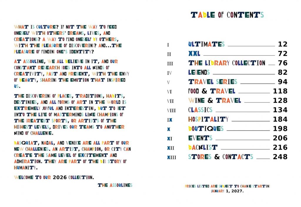
Turning the set into a working font let me test it through typing, rather than only arranging a specimen. Its value was not in making a practical replacement for the catalogue’s typography. It was in seeing how much of a book’s visual identity could remain in one extracted character.
Method 2: color
For the color experiment, I reduced the catalogue’s backlist index to 530 flat swatches, with a small title label attached to each one. I arranged the same set twice: once by color and once in the catalogue’s order. Both versions became a grid and a continuous strip.
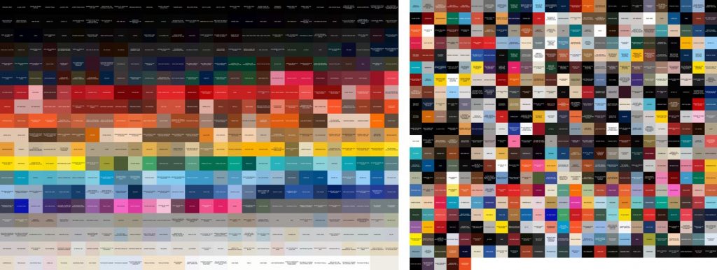

The color sequence made neighboring books look connected even when their subjects were unrelated. In the catalogue-order version, those smooth transitions broke apart. Comparing the two made the organizing rule visible: the material had not changed, but its apparent relationships had.
The small labels kept a route back to the books. Without them, the sequence could become an abstract image with no need for a catalogue at all. I wanted that tension between the pleasure of the color arrangement and the information it had removed to remain visible.
Method 3: photographic cutouts
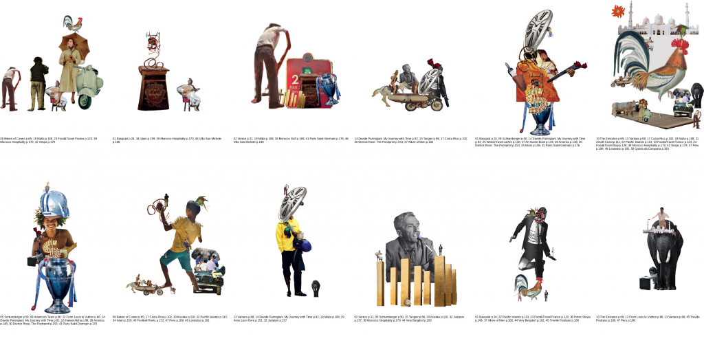
I selected one object from the photography associated with each of 50 featured books. Removing the surrounding scene changed how I looked at the image.


I then made 12 collages, using overlap and changes of scale to create relationships between objects from different books. The strongest arrangements moved beyond placing objects side by side. One image could interrupt another, become its setting, or change what it appeared to be doing. This continued the compositional work from Skin on Skin, but the fragments now came from a publisher’s collection rather than photographs of myself.
Method 4: the atlas
The Detail Atlas moved in the opposite direction from the cutouts. Instead of preserving a recognizable object, I enlarged a small part of each photograph until the subject became difficult to identify. The same 50 books became a set of colors, surfaces, and textures.


I kept the tiles in catalogue order and also developed them into a jigsaw image. The labels could tell the reader where a detail came from, but the crop alone often could not. Looking became a process of trying to connect a fragment with an absent whole.
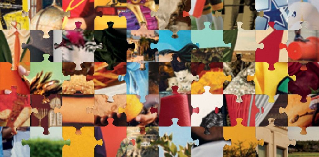
Together, the four experiments showed me how much a catalogue depends on the feature chosen to stand for each item. A title, a color, an object, and a texture could all refer to the same book while offering very different accounts of it. The cutouts gave me the most room to continue: they could retain something recognizable from each publication while allowing another story to form around it.
Week 2: the design diary
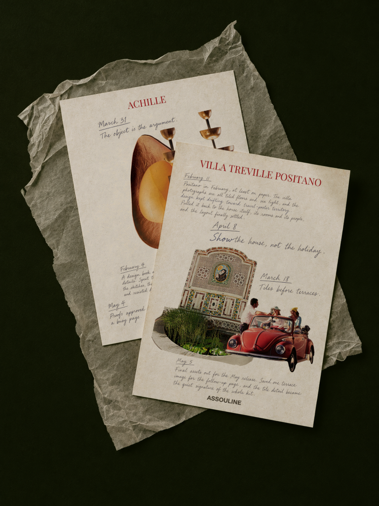
For the next stage, I wanted the photography to carry a story rather than remain a set of visual experiments. My experience at Assouline gave me a way to approach that story from inside the work. Instead of making another catalogue of subjects, I began developing loose, postcard-like sheets that paired imagery from a book with diary-style writing about working on its press materials.
The writing was developed retrospectively for this project, rather than reproduced from an existing journal. I used the diary form to bring a personal voice into a collection usually presented through finished images and carefully edited descriptions. Short entries could sit beside longer reflections, allowing work, mood, and ordinary pauses to share a page. I focused the writing on the smaller decisions and interruptions surrounding press materials, rather than giving each book another promotional description.
Narrowing the selection to 18 titles released during my time at Assouline linked the collection to a particular period of work. The release dates provided a structure for the entries, while the writing could move between a design decision and a passing thought.
I tested a single cutout and a fuller collage for each title. The collage version gave me more ways to build a page around the character of the book. Unlike the week 1 compositions, which mixed sources, each of these sheets stayed within one publication. The title kept that connection explicit, while the imagery and notes gave the reader more than one point of entry.
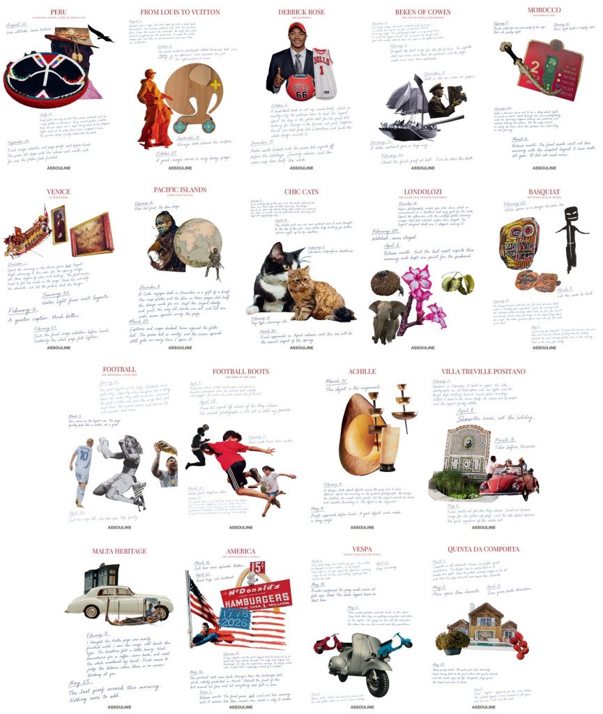
I worked toward a layout in which the writing moved around the images rather than sitting in a separate block. The lengths and sizes of the entries varied so the page could hold different rhythms. A brief thought did not need the same space as a longer account, and the image did not have to sit above the writing in a fixed hierarchy.
The collages needed real interaction between their parts. I adjusted scale, overlap, and the balance between image and writing so that the sheets did not become repeated templates. The cutouts stayed flat within the artwork. Depth belonged to the presentation of the paper, not to a shadow making each image look like a separate object.
Week 2: final outcomes
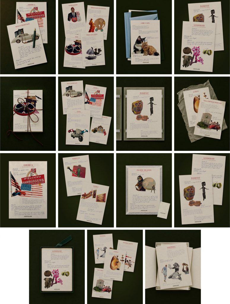
I developed the sheets as singles, pairs, and small groups, using muted paper against a dark emerald background. Texture, light, and soft shadows gave the pages a material setting. Overlapping sheets allowed the collection to appear as something that could be handled and returned to, rather than only read in a fixed sequence.
Where the project is now
The project has moved from extracting visual features to reconsidering what can hold a collection together. In week 1, the rules came from the catalogue’s visible material: letters, colors, objects, and details. In week 2, my connection to the books became part of the organizing structure. A publication could be approached through the work and personal voice surrounding it, rather than only through its subject.
That shift also leaves a question about how the sheets are read. The diary form suggests intimacy, but it is still a designed representation. Its dates, handwriting, and fragments of thought shape an impression of experience; they are not the experience itself. I want to test how the collection reads when it is physically handled, rather than assume the material feeling of these images is already the experience of the work.
Leave a Reply